
The main design was created in Illustrator CS6 but earlier versions, at least to CS4, have the functionality to create this.
Triangle ‘Template’
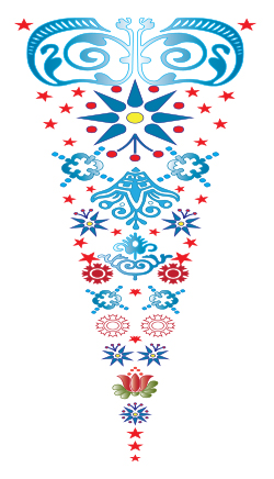
1. I started by using the Polygon tool in Illustrator to create a triangle. Mine was 90mm high x 31.3mm wide. I used trig so that I could calculate an angle of 20° (the Sine of 10° times 90 – gives half the width of the base ) at its apex so could rotate it later without overlapping.
2. Lock the layer. The triangle will be subsequently deleted but you will use it as a template to ‘contain’ all the graphic elements you want to include in your design.
3. Create a new layer.
4. Draw, import, etc, graphics to ‘fill’ your triangle , starting at the top and reducing the size of the elements as you proceed down the template. I used Caslon Ornaments (True Type free font – just Google it and you will find it easily).
Modifying Font Characters and Glyphs (Optional)
5. To further modify and decorate installed fonts, characters and glyphs, go to Type>Glyphs and go through your installed fonts for pretty dingbats (like me! Lol!) or other Wingdings, etc, to see if there are other ready to use elements for your design.
Switch to the Direct Selection tool (black arrow) and go to the drop-down menu: Type>Create Outlines.
6. Go to the Object menu and select ‘Compound Path>Release. You might need to go to the Swatch palette and change the Stroke to, say, 0.25 and remove the fill colour as they sometimes end up filled as a solid block of colour.
Once released, the separate elements of the graphic can be coloured individually – filled with a gradient or solid colour, stroke colour can be changed,etc. When you’re done, group them (Object>Group).
7. I created a centred vertical line of elements – remember to select them and use the Align command to centre them vertically. Select then Object>Group.
8. Fill the template up with more graphics – just do either the left or the right of your centred line of elements. Taper and reduce the size of the elements as you fill up the triangle shape. Get a number of them to touch the triangle outline to preserve some definiton of the triangle shape.
Back to the kaleidosope-design
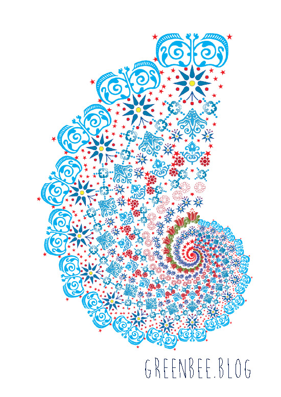
9. Select and group these side elements (ie, de-select or omit the central ones). Group then Copy them (Command >C).
10. Paste the elements (Command V) then go to Object>Transform>Reflect>Vertical.
11. Align the right and left sides of the design to the top or bottom (makes no odds which end). Make sure that you position the copied elements so that they touch the opposite side of the triangle.
12. Group right and left sides. Now select the right, left and vertically-centred elements. While all are selected, click on the vertical group (so that everything aligns in relation to this) then select Align>Vertical Centre (icon). Group the three sets together.
13. You can delete the layer with the triangle on if you wish. It has served its purpose and is no longer needed.
14. Select your ‘triangle’ of graphic elements. Go to Effect>Distort & Transform>Transform.
A dialogue box with various settings will display:
a. Scale (Horizontally & Vertically) 90%
b. In the Number of copies, enter 17 (results in 18, the 17 copies plus original).
c. Rotate>Angle: Enter 20°
d. On the small square with 9 black spots, click the bottom-middle spot.
Hit: Ok
15. You need to go to Object>Expand and Ungroup if you want to tweak your design in any way.
That’s it. You can play with Bevel & Embossing or different lighting effects under the filters etc. Change the background colour. Make multiple copies of the ‘fractal and mirror or reflect them, scale them. It’s up to you and your imagination but this is how to create a basic kaleidoscope effect in Illustrator. You could always copy into Photoshop and use the PS tools if you’re more familiar with them.
Hope you enjoyed the tutorial.

 *** Image originally posted in my previous blog: The Singing Tree ***