A blog for me, about the things I like. After Effects, Procreate, Illustrator, Photoshop, Drawing, Painting, Paper Cutting, Sewing, Embroidering, up-cycling old furniture. Whatever grabs me in the moment/
Today I’m posting a tutorial on how to create the reflective glassy ball as seen in the image above.
It’s based on kdigits video but has lots of changes all detailed in a step-by-step illustrated set of instructions. Mine is created with Illustrator cc but don’t think there are any new tools it uses that aren’t in CS6 or possibly CS4/5.
The tutorial is a free pdf download and hope you give it a go and enjoy it.
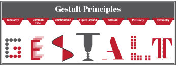
Gestalt principles describe how our brain takes visual elements and frames, or consolidates, them into a visual organisation that we are familiar with. We are wired to see structure and patterns; they help us make sense of our environment. The name ‘Gestalt’ was given by a group of German psychologists who developed theories about how people perceive the world around them and the power that psychology has to determine visual communication.
These principles give us a set of guidelines to help us become better information designers. Aesthetics are very important but for communications to be understood clearly, function must always come before form. Gestalt principles demonstrate that we order our experience by means of systematic order – we ‘like’ pattern, structure and logic. So, what do they mean and how do we make use of them? They help us to make design decisions about which elements will be most effective in different contexts, eg, separating elements by means of colour or distance help differentiate one set of elements from another and prevent misunderstanding and ambiguity. We can use them to direct attention to specific focal points and guide users through processes, for example.
Similarity
This principle states that if elements seem to be similar, we group them together and assume they have a common function. We have contextual clues in the picture above; we know the word is Gestalt so we are already predisposed to order the arrangement of circles into the letter ‘G’ and we easily accept it as a letter as it conforms with our letterform schemas.
Common Fate
If elements appear to be moving in the same direction as being related to one another. Our brains simply see direction and then imposes a logical progression… we could easily imagine the letter E fading out to infinity.
Continuation
When we see elements in a curve or a line, we see them as related and distinct from other elements.
Figure Ground
This principle states that we actively perceive objects as being either background or foreground. We can use this principle deliberately for interest or to direct focus mindfully. The Middle ‘T’ in the word above plays with foreground and background so you either see a table or two people’s faces.
Closure
If we are presented with seemingly disparate elements our brain tries to discern a meaningful pattern within them. In other words, we fill in any ‘blanks’ to make something recognisable. We see a capital ‘A’ in the picture above despite it missing one side.
Proximity
The principle of proximity states that elements placed close to one another are more related than elements more distant. The power of proximity overrides colour, size and shape. Proximity is a strong guiding principle for page layout , arranging elements like images and text to create a cohesive flow.
Symmetry
This principle states that if elements are symmetrical, we perceive them as a single group or object. The letter ‘T’ above is clearly split down its vertical axis yet is still an obvious T.
Being able to consciously identify key elements of communication from your designs is a strength; there is real power that comes from being able to identify and articulate what makes your designs meaningful and strong vehicles to carry your communications with clarity. The more you become conscious of how and why your design works the better you are able to communicate.
Today I’m giving you a set of free Illustrator brushes to create some stunning pattern designs.
You don’t have to create mandalas, of course, draw any curve or line or shape and use the pattern brushes to decorate them any way you want. I’ve saved them as Tints so you can change colour without having to expand them.
Unfortunately, security on WordPress doesn’t allow me to share ai. or zipped files with you as downloadables. If you want them, just place a request via comments with your email and I’ll send them to you that way.
We’ve all seen those super infographics where shapes are broken into jigsaw pieces to denote stages in progress, etc. They can fool you with their seeming simplicity but there’s a bit more than meets the eye. Learning the techniques is worth a little bit of effort and I’m sure you’ll come up with brilliant designs that use the principles to convey information in a compelling way.
Today I’m giving you a three-in-one tutorial.
Make jigsaw pieces
Make a pencil
Create a rainbow brush
The tutorial is fairly long mainly because I’ve taken screen shots and documented each step. If you’re familiar with Illustrator you might find it a bit pedestrian but if you’re just getting going, there’s lots of things to learn in a friendly way. 🙂
Today I’m giving you a tutorial, not how to create the same as above but lots of things you can create to fill a letterform. They’re mostly basic mini tutorials but if you’re new to Illustrator you might find them useful.
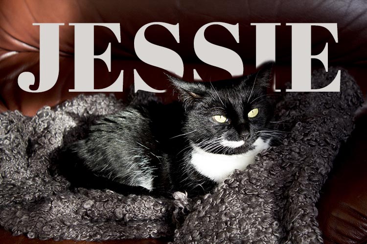
This is Jess. She developed diabetes early last year and it’s taken a lot of experimentation, a couple of changes of insulin and various dietary changes to get it under good control.
She’s now a new woman. Still feisty with an attitude you can hang your coat on and still loves a fishy supper. Charlie calls her ‘the one with the breath’ but not so as she can hear him…
She’s my sweet girl and though she’s calmer than the fearful rescue cat from a few years ago, and she’s more Paws than Claws, I’m still careful around her. We love her to bits and after being with us 6 years now, this is her forever home.
Down to business. Look at the image and you’ll see the text goes between her and the background. It’s actioned with a simple masking technique in Photoshop. If you want to know how to do it, download the pdf for the instructions:
Photoshop lets you mask layers and edit images without any permanent destruction. Paint with black and you erase parts of an image. Gone too far? Then paint detail back with a white brush.
It’s all made clearer in my tutorial – click below for the pdf instructions: